Proctorio • 2020
Exam Settings Redesign
I redesigned Proctorio’s settings UI to help instructors easily and responsibly set up their remote exams.

Context
Proctorio provides remote proctoring services. Instructors can choose the proctoring settings through a UI that integrates directly into their exam platform.
This is a critical UI, since it affects not only the instructor's experience, but also the test takers'.
In 2020, I was tasked with redesigning these settings. This was done primarily as part of our integration into McGraw Hill's (MHE) Connect platform.
Goals
- Make it easier to use for new users while keeping it familiar to current ones.
- Encourage responsible use of the settings.
| Where: Proctorio |
| My role: UX & Design Lead |
| Time frame: Jan. 2020 — June 2020 |
Collaborators:
|
My responsibilities:
|
What needed to change?
This redesign is the foundation for the next version of the company's software. So it needed more than just a makeover.
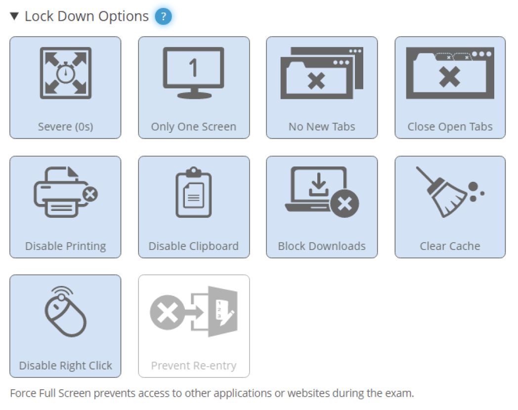
This is a snapshot of part of the previous design. There were a few questions I needed to explore in order to approach this redesign:
- How do novice and experienced exam administrators use the settings?
- Which settings do exam administrators use, and does it vary depending on the exam?
- Which settings do exam administrators use, and does it vary depending on the exam?
Research Methods
To explore these question, I used a few different methods.
Interviews with current users
Understand how users currently set up their exams.
Literature review
Understand pedagogy, ethics, and privacy risks. Draw ideas for solutions.
Analytics & internal feedback
Understand business goals and usage of certain features.
Heuristic analysis
Systematically identify some of the current issues in the UI.
Findings
1. Related settings are separated
Settings that work towards the same end-goal or that depend on each other are placed in separate places of the UI. This can cause important settings to be missed.
2. Low-level settings
Settings are very technical and relate only to what it will do, but not to the why behind it. This can cause users to not enable one of multiple settings needed to achieve their desired security.
3. No awareness of the test taker experience
It is unclear the impact each setting will have on the test taking experience. This can result in overly strict settings being used unnecessarily.
4. No guidance on choosing the settings
Exam administrators have no guidance on which settings they need to choose for their kind of exam. Instructors may need to resort to trial-and-error to find the right settings.
Redesigning the UI
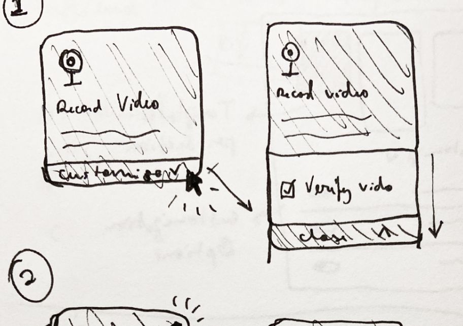
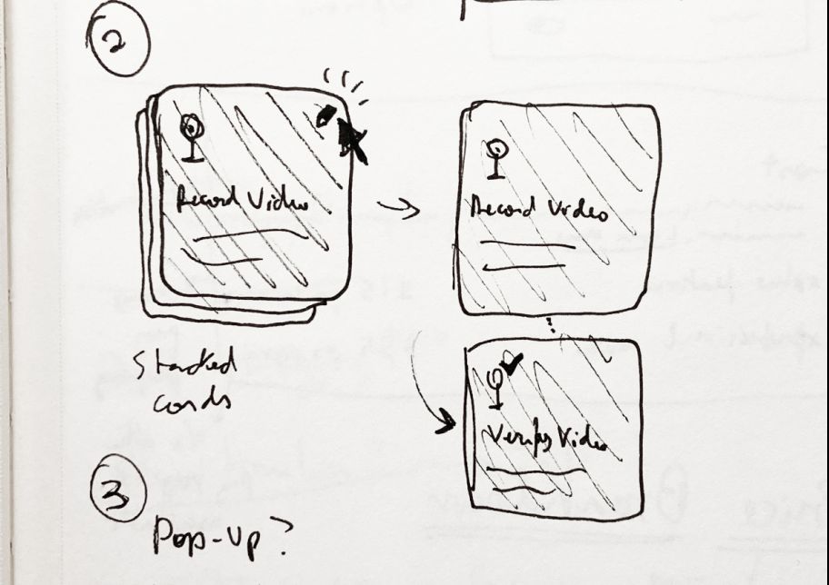
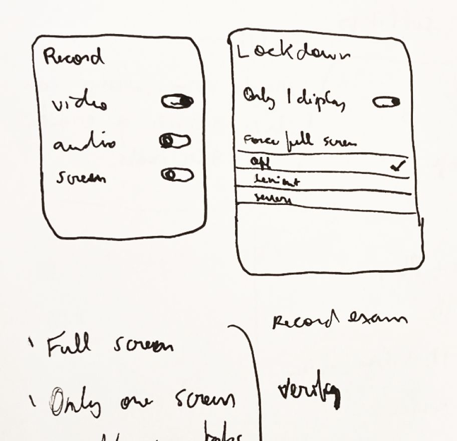
Having determined what needed to change, I opened my sketchbook and began drawing models and playing around with options.
I began this process by sketching out different options, but ultimately landed on the model described below.


The new settings tile
The redesigned tile changes a few things:
- The setting description appears directly on the tile.
- Some settings have been grouped into a single customizable tile. More on that below.
- A green checkmark reinforces that the tile is on.
- New icons and a dynamic transition animation.
Grouping settings
To address issues #1 and #2, I grouped related settings together into customizable tiles.
All options within the tile are shown in a list, with disabled options being crossed off. This allows users to both know that the option exists as well as its current state.
Clicking the customize link expands the tile, showing all customizable options.

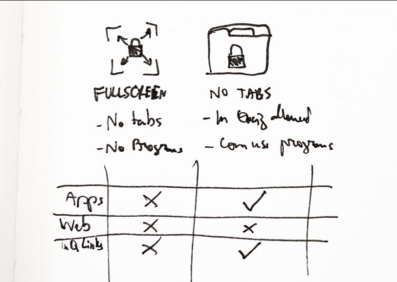
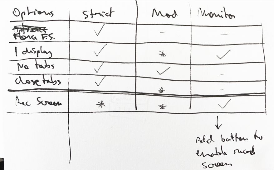
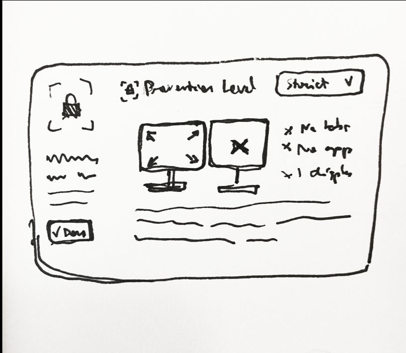
Untangling a complicated web of dependencies
This model worked well for most tiles, with one exception: the ”Control Access to Apps or Websites” setting. The options inside of it are connected through many technical dependencies that are not known by the user.
In practice, this means users would see options being automatically turned on or off without knowing why. This was an indication that this tile needed to have its mental model refined further.
To address this, I mapped these options to two dimensions:
- What kind of resource the option blocks;
- How strict the options is.
The result is a consolidation of these options based on how strict they are: strict, moderate, or lenient.
Guiding the choice of settings
So far, the design has addressed mostly usability issues. But we also wanted to provide more guidance on which settings to choose.
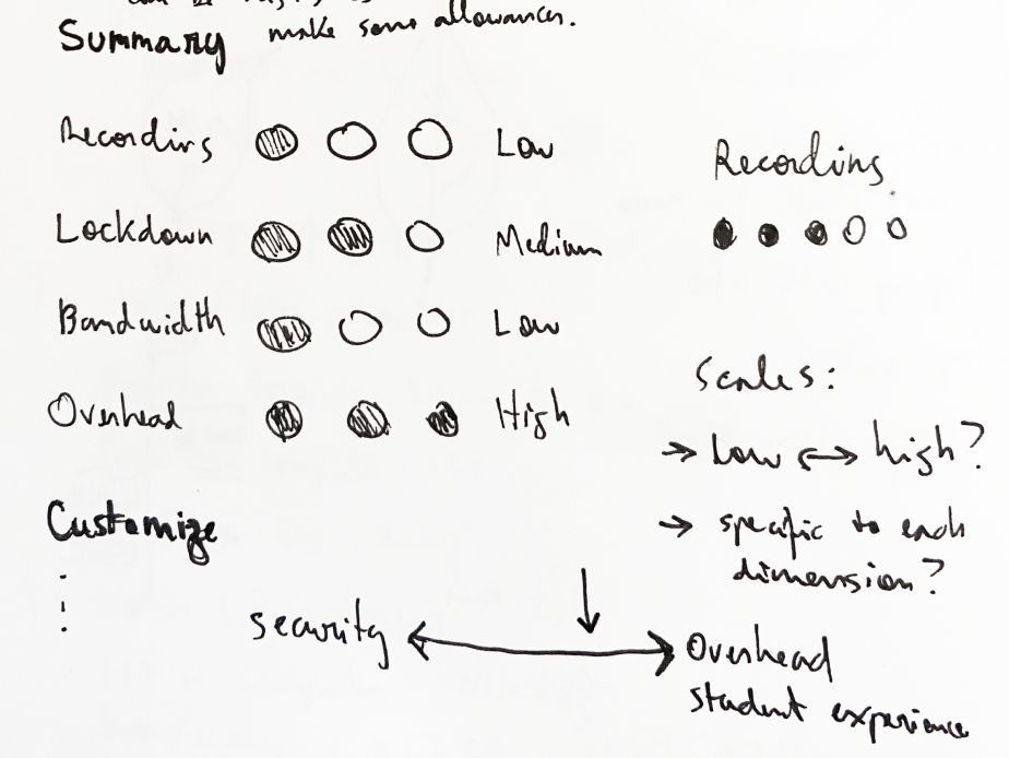
The Exam Summary
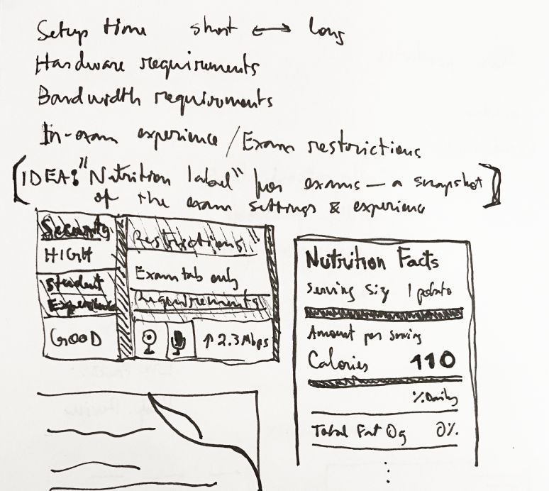
The previous design had an exam summary, which provides very technical information such as the bandwidth required for the exam. But this was not helpful to instructors. In fact, none of the users I talked to reported ever using (or noticing) it.
The idea was to revamp it more around a high-level ”nutrition label” for the settings. The core part of this label would be a metric showing the balance between security and the test taker experience.
Discouraging high-security settings
For high-security settings, we chose a more active approach than we did with the exam summary. In this case, we chose to prompt the user before enabling a high-security setting. The prompt seeks to:
- Prompt them to re-think whether the feature is needed for this exam.
- Provide them with the information to prepare test takers—a critical step for reducing anxiety.

Saved profiles: making the choice for user
Another way to guide users to reasonable choices is to provide them with pre-existing saved profiles that exclude high-security settings. This way, opting into high-security settings would always be an extra step instructors would have to take.
To increase the likelihood of these profiles being used, they have to be useful to a wide range of exam administrators.
Through interviews with exam administrators and the use of analytics, we developed a set of five default profiles. Talking with users helped steer us alway from creating profiles on a scale of progression (e.g. low/mid/high-stakes) but rather tailor them to specific use-cases such as open book exams or only needing to verify the identity.

What I learned
Some of the lessons I learned during this project.
Conciliating business, technical, and design requirements
The main challenge in this design was conciliating complicated business logic, technical constraints, and the design goals. The workflow I found helpful to work with these is to:
- Sketch out all settings and their connections and look for a higher-level abstraction over them.
- Frequently consult technical and business stakeholders to ensure the higher-level abstraction works.
- Do very quick internal testing, especially with team members who often interact with stakeholders.
Collaborating with external teams
This was my first project at Proctorio in which we collaborated with an external team (McGraw Hill). The design was entirely done by me, but we frequently would ask for feedback to ensure alignment with their goals.
- Putting decisions and rationale in writing goes a long way to build shared understanding.
- Internal and external priorities may not align, but are not necessarily mutually exclusive. It's important to find common ground between both.
Working with limited prototypes
Most prototyping software would require me to create a different screen for every combination of toggled options—an incredibly tedious and error prone process. Here's what I did instead:
- During early testing, I prototyped a limited amount of combinations and planned the testing tasks around them. At the settings I'd make sure to set the correct expectations with the user.
- Later in the process, I was able to built a prototype using our front-end components, which allowed for more open-ended user testing.
Be careful not to make things “too” high-level
I explored the idea of first showing the saved profiles to the user, only showing the full settings if they chose a “custom” option. This depended heavily on the settings summary to convey exactly what was enabled, so this option partly did not work because the summary didn't work. But during testing I also observed that exam administrators were also looking for a finer-grained “settings-like” page.